Saturday, 26 March 2016

E4 Ident Progress (Maya) - Building the Skeleton

I started to build the skeleton for my character. The skeleton consists of joints and bones, joints can be placed and are the pivot points between bones. Bones are connections between joints, the process of creating these connections is called parenting. This is a connection between a child and a parent, the parent is the leader and however the leader translates, rotates or scales, the child will follow along and do exactly the same as the parent except the child's values will still be at 0 when following along with the parents modifications. It is only when the child is moved itself that it gains values and the parent will not move with the child.

There are different ways to use the rotate tool in Maya, or rather there are different ways to use the rotate tool to rotate objects differently. For example, under the settings for the rotate tool there are options to set it to world or local. Setting it to world means it is aligned with the graph and the top, front, side viewpoints, however setting it to local means the rotate tool is aligned with the object itself. This local setting is very useful for aligning the axis of the joints. Aligning the axis of the joints correctly is very important because otherwise the rotation axis will rotate an odd unrelated direction that is no help in moving your character realistically. I encountered this problem with the legs where they were rotating out to the side instead of forward and up. 

I could have solved this problem by rotating the joint manually and eyeing where it would be most accurate but instead i decided to use a script that i downloaded off the internet that automatically aligns all the joints in the hierarchy so that each joint's rotation axis is pointing to the next joint. Even though i am still learning Maya i think it is alright to use scripts to speed up the process aslong as i understand what the script is doing and aslong as i understand how i would do it without the script. In this case i used the script because it is alot more accurate than doing it manually.  

At first the joint on the wrist was hard to align because it split off into 5 different joint chains for the fingers and the script i was using was not working for this joint so i had to remove the fingers except the middle finger and then align the wrist joint to the middle finger joint. I then moves the fingers back and parented them back to the wrist joint.


E4 Ident Progress (Maya) - Altering Model and Texturing

I realized my character should be modeled in a t pose because when it comes to rigging/skinning the arm needs to be deformed both ways, up and down, therefore it needs polygons to deform and when the arm is modeled down there are usually not enough polygons below the arm which was the case with my character.


Then my mesh was ready to be textured so first of all i needed to create seams on the model like seams on pieces of clothing. This is because to apply textures to my model i need to unwrap it and flatten it so that an image can be projected onto the model.  I found texturing the model quite simple and didn't encounter many problems except that the texture was very stretched on the ears so i decided to make the ears separate UV shells. 

After unwrapping the mesh i then exported a UV snapshot and added textures and painted details such as the belt buckle on Photoshop.

Below is the textured model with the temporary smooth applied.


Thursday, 17 March 2016

Abandoned warehouse

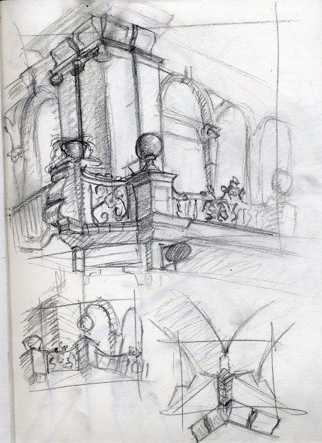
I went to an abandoned warehouse for one of my places to draw, I found it interesting to draw because the building was falling apart and it made it different. These are the reference photos of the place.


Evaluation

For the visual language module I have learnt a lot in terms of my drawing skills and overall drawing practice. Throughout the study tasks I have experimented with different mediums and used different approaches to drawing.

The main thing I have learnt from this module has been to think cinematically when drawing and have worked on composition elements within drawing practice. Even when making studies in my sketchbook I am thinking about the drawing as a whole instead of just not paying attention to anything but the subject.

For the set, series, sequence task I got the word octopus and I enjoyed this task, it was fun to experiment with different compositions and ideas and because there aren’t any octopuses to draw from life available to me It got me to draw from my imagination instead of entirely from reference.

The next study task was captain character, which consisted of character design. I struggle with character design a lot because I find it hard to design exciting characters but I learnt that altering the features of the face and body and using basic shapes to experiment with the body shapes really helps to build good characters.

The next study task was you spin me right round which consisted of a drawn character turnaround of our character that we created on the last study task. This went well, I made sure the figure kept the same mass throughout the turnaround and made sure to make her look consistent. One thing I got confused about was that the turnaround had to be thought of like a clock with the 12 frames but once I got my head around that idea it wasn’t too hard to animate.

For the environmental storytelling brief we had to visit 3 places and draw 5-10 drawings for each place. My first place was kirkstal abbey, I picked this place because I thought it would be interesting and good practice to draw old ruins of buildings. Also there is a good opportunity to think cinematically in that environment. The second place was an abandoned warehouse where everything was falling apart and broken; I thought this was an interesting place to visit because of the building falling apart. The last place was victoria quarter, I picked this place because I liked the detail on the walls and the lines of shops were good for perspective drawing.

The last task was the form, flow, function task. This was my favourite task, I had never though enough about the weight of the figure when drawing when I really should have because weight is very important in drawing the human figure and I have only realised how important it is.

In conclusion I have enjoyed this module and have learnt a lot from it such as focusing on composition and the picture as a whole a lot more. Also I have learnt about weight and how important the rhythm and weight of the figure is to the drawing because the drawing is nothing without the foundations of the drawing.    

Set, Series, Sequence 12 drawings

These are some drawings from the 12 further drawings. The drawing below is from a low angle looking up at the octopus because i decided to really get used to the form of the octopus i need to draw it from different angles.
The drawing below uses clean flowing lines of ink, i like this because it's nice to draw as a process and it looks nice, maybe abit simple but still nice.

In this drawing below i also used ink but i used it differently for this drawing. I did it the same way for the outline but for the rendering i used a small amount of ink and wipe the brush abit then i used the side of the brush to add rough looking textures to the octopus.


Set, Series, Sequence Storyboard

This is my storyboard for the set, series, sequence brief. I based the story on the drawings of the octopuses i did which were mostly dark around the octopus so i thought i would have a story about how the octopus is all alone at the sea bed in darkness and a light comes to him but its only an angry fish passing through. i have tried to use interesting camera angles and framing, for example i have a few close up shots to focus on the octopuses expression. I also think i have done well to describe the story using the drawings because even without looking at the text underneath the drawings it is clear to the viewer what is happening in the story.

Aladdin Backgrounds

The setting for Aladdin is a fictional arabian city called agrabah so the colour scheme is suited to the arabian setting. In the background below the perspective and position of the camera is very extreme so this background would be for an action shot presumably or maybe a long line of horses walking through the city. Because of the low angle shot it would make the horses seem menacing.


These backgrounds below are for panning shots, the colours are very yellow which gives a good contrast to the dark blue magic carpet.


The background below shows the city from a very low angle looking up at the purple sky, this gives a sense of danger because all the buildings have a reddish tint because of the sky and red is a colour associated with danger.


Wednesday, 16 March 2016

Expression in drawing

The thing i love about animation the most and the reason why I'm on this course is the fact that the art of drawing is a medium to convey feelings, emotions and a drawing is an extension of the artist. Assuming the artist is skilled in the technical aspects of drawing he can then communicate his feelings to another person without words or anything but marks on paper. With animation however there is a greater potential for expression and visual communication as the drawings can now move.

The drawings below are keys from Pocahontas and are so expressive, the fact that they are so well drawn allows the expressive quality of the drawings to come out.


Victoria Quarter Environmental Drawings

For one of my interior places for the environmental storytelling brief i went to victoria quarter. These are some studies i produced whilst i was there and some photos i took for further reference. I liked the perspective of all the lines of shops and the ceiling which was a dome like shape.


Tuesday, 15 March 2016

Octopus Transfiguration

For one of my octopus drawings i thought it would be good to try depicting the scene of the transfiguration but with octopuses. i tried to keep good perspective for the octopuses at the bottom of the scene but i think the tentacles could be more in perspective, i like the flowing tentacles of the jesus octopus and the two octopuses on clouds, i think it gives the impression that the octopuses are floating.


Pages From My Sketchbook

These are some pages from my sketchbook. I think its very important to study the skeleton as much as possible because the figure is derived from the skeleton. i have hundreds of studies of the skeleton from life, not just the skeleton itself but of the bones individually because there is a vast amount of intricacies in the shape of the bones such as processes and eminences which are anatomical terms for bony projections on the surface of the bones. It is important to know where these features are on the bones because these provide attachment points for muscles and ligaments.


These are studies from life, there's a ton of mistakes that i'v picked up from these drawings such as the construction of the nose could be defined a lot more and the form of the mouth shape in difficult angles needs work, the second drawing down for example. Even though these are just studies i have still payed attention to the image as a whole. For example in the drawing directly below, the lines of the clothing to the left all point towards the focal point of the drawing which is the eyes.  


Form, Flow, Function Drawings

For the squash and stretch drawings i tried to focus on the way the forms of the body squash and stretch  when performing actions. For example the drawing below was a person performing a squat into a plank, i liked the way the body squashed into a ball like shape and then stretched into a plank position.


For the second squash and stretch drawing i decided to use ink because i'v never really used ink with a brush before and i really liked using it. I liked the fact that the lines feel more defined and if the lines aren't accurate it really shows. In this sequence the model is throwing a ball, the squash is the anticipation of the model recoiling preparing to throw the ball and the stretch is where the person is stretched out to release the ball.

The drawing below is a 20 minute pose. For this pose the weight is quite central, the line of balance is right through the centre of the figure, right between the feet. The weakest part of this drawing is the feet because i struggled to show the form of the shoes so the result looks flat and uninteresting. To improve my understanding of this section of the body i am going to make studies of the bones and the structure of the foot and make studies of feet from life.

In the 20 minute drawing below the weight is again very central, in the 20 minute drawings i guess the weight has to be central or it would be a struggle to hold an off balance pose for an extended amount of time. I think for this drawing i should have made the light more defined and more concentrated, also i think the torso is a little stretched.


Life Drawings

On tuesdays i go to a life drawing class at the fenton pub. I have been going for about 2 months now and i can really see my drawing skills improving gradually. I think the most noticeable change in my skills from a year ago is the construction and form of the figures, i think i have a decent understanding of form and light and shadow, i have began to realise that the saying "draw what you see" is incorrect and that really the experienced artist doesn't draw what he see's he draws what he knows about what he see's however this is not to be confused with symbols like children's drawings or Picasso. But what i mean is that when the artist has a good understanding of the structure of the human body, how all the muscles connect to the bones and how the muscles work, instead of merely drawing lines on paper of what is perceived on the retina, the artist can instead create a three dimensional representation of the form of the figure.


Monday, 14 March 2016

Pontormo Studies

Jacopo Pontormo was an Italian painter. His studies are fascinating and show his mastery of depicting form and light. The drawing below is good example of a study, for example the form of the ribcage is shown by the two curves on the bottom lesser finished drawing and the connection of the mastoid muscles to the collar bones is shown by the line from the head to the top of the torso. Pontormo is very good at blocking in form, for example the hand is very blocked in, the form is very clear.
In the drawing below the forms are very accurately defined, every line is there for a reason, either to define the form of muscles/bones or to show plane changes, such as the line on the head of the figure to the left which shows the plane change of the side of the jaw to the underside of the jaw/the chin. Pontormo has a very unique way of drawing hands that i have noticed, in which the fingers are very blocked out and pointy. This shows that even though every artist may see the same forms as they are in life, when it comes to representing the forms the artist develops different conceptions of forms over years of studying the structure of the human figure.