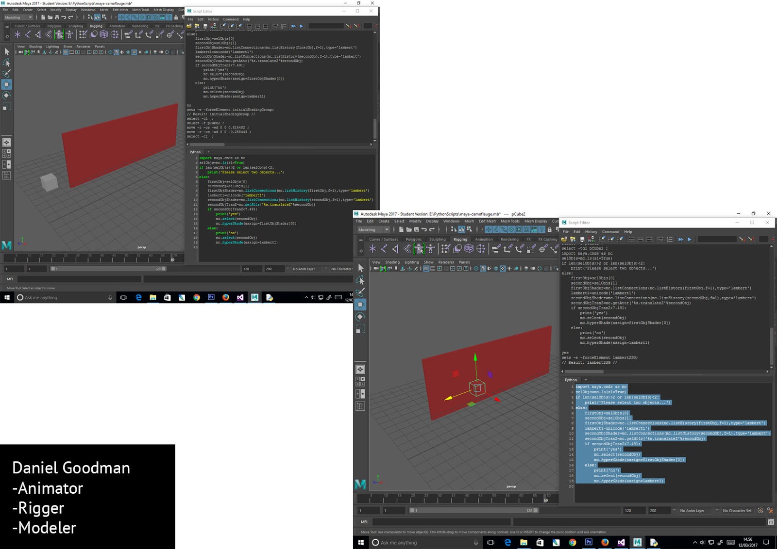
This week i was mostly working with premiere, compositing the animation and making sure everything is put together right.
This week was very busy because we didn't realise how much we still had to do in terms of getting the animation fully completed and putting everything together. I find this is always the case so maybe next time i will account for this more.
In terms of blogging i started off blogging a lot and making sure i explained everything well but as i got into the production stage i spent a lot more time actually practicing my craft which instead of putting lots of effort into blog posts which don't impact me at all really. Whilst learning and practicing animation is what's going to improve my skills and therefore get me job opportunities. Therefore i have sacrificed my grade for my practice, obviously these should be parallel but they are not.
Anyway moving back to the project, below is a demonstration of all the animating i did for this project. I did the majority of the animation work, so i did all the keys and alot of the inbetweens and clean ups. I also did all the audio except the sounds from the internet and the interviews which we did together.
Wednesday, 17 May 2017
Applied Animation - Week 15
This week we started putting everything all together, i captured all
the frames using dragonframe as this is much faster than scanning them
in. Then using photoshop we all cleaned up the frames, removing the
white colour of the page except for the characters. Then whilst Guy and
Meg finished cleaning up the frames, i began compositing the frames in
premiere.
Before compositing in premiere we needed to get the backgrounds finished, to a standard we were happy with. I used research from a few layout books and used inspiration to create the feel of the backgrounds. I wanted to keep the backgrounds very abstracted and minimalist as to not complicate the scene and not to take away from the focal points of the characters.
I took inspiration from flicking through the book "The Noble Approach". This book had some interesting background designs. It showed me that using maybe only two or three colours can still form a very suggestive but abstracted background, which is what we wanted.
After we scanned in the background, Guy edited them on Photoshop and added additional light/shadow, which was a huge improvement and by this point we were very pleased with the backgrounds.
Before compositing in premiere we needed to get the backgrounds finished, to a standard we were happy with. I used research from a few layout books and used inspiration to create the feel of the backgrounds. I wanted to keep the backgrounds very abstracted and minimalist as to not complicate the scene and not to take away from the focal points of the characters.
I took inspiration from flicking through the book "The Noble Approach". This book had some interesting background designs. It showed me that using maybe only two or three colours can still form a very suggestive but abstracted background, which is what we wanted.

After we scanned in the background, Guy edited them on Photoshop and added additional light/shadow, which was a huge improvement and by this point we were very pleased with the backgrounds.
Applied Animation - week 13 and 14
I finished all the keys during these two weeks and since guy was bogged down with other work I've started doing the inbetweens also. I have managed to organise my time very well over the past few weeks. We have had deadlines for COP and responsive but i have still managed to set time aside for working on applied during this time, this is something which Guy and Meg have not done. However this is alright because i don't mind keeping the project on schedule whilst Guy and Meg sort out their other work.
I wouldn't say I'm the most organised person, I'm quite messy and i have never thought of myself as being organised. But i have managed the deadlines this year very well and have set myself more projects which i have done in my spare time as well as the set work. Due to this, i have naturally mediated towards the director role for our applied group.
I really like being the director because i like having control over the project, this isn't to say Guy or Meg doesn't, we all have an equal say in everything. I just feel like I'm naturally taking charge of the project, i think this is because i am organising my time well.
When animating the girl, the motions had to be more fluid than the other characters because she is younger. I really tried to get the anticipation and the arcs in there and i think i did a good job with the child's animation but it could have been better through more subtle movements of her face, more accurate and intricate expressions which narrow in more on what the character is thinking about.
I used reference for the girls motions, especially for her shuffling back into a comfier position.
Sunday, 14 May 2017
Applied Animation - Week 9
This week our priority was the character designs and the animatic. For the animatic we needed to get the voice of the grandmother recorded. On Thursday we went to the sound studio with a member of student support who had a slightly raspy voice. When thinking about the right voice for the grandmother we realized we didn't need an old person to voice her but rather a raspy, tired voice. This is because there's nothing really that different between a youthful voice and an old voice except from a more tired, raspy, mature tone.
Whilst in the recording studio, the words didn't sound right and sounded very forced so we told her to just imagine herself in the scenario of the character and just say what comes naturally instead of acting out these specific words. Instead of saying "nice weather today isn't it?" which was in the script, she said "nice weather today" which felt much more natural and believable.
To make the animatic i was working with Guys storyboards. This was quite challenging as there were way to many storyboard panels for the first scene. The subtleness we discussed before was absent in the storyboards but guy was open to changes to make parts more subtle.
I understand it's hard to get the story across clearly in the storyboards as our narrative is very subtle and needs very acute attention to detail so guy has had a hard job with the storyboards and although they still need some improvements they are good enough to work from.
Understanding the way people think about things and how different people have different approaches to solving problems is important when working together collaboratively. Guy takes quite long to do tasks but he usually produces good work. Understanding peoples weaknesses and my own weaknesses is very important also, being honest about weaknesses allows a greater workflow. For example in our project the idea of our narrative is to be subtle, Guy cant do subtle, but that's ok because me and meg can help out as we have more of an understanding of how to be subtle.
Another instance of this principle is when i took over the character designs from Guy. I thought i could manage to think of a good, well designed character but unfortunately I'm quite poor at design work in general. I am more technically proficient, therefore i was struggling and Guy took back control of the character designs and produced some really nice designs which i will come to later.
This is why acknowledging your strengths and weaknesses and being clear about them helps collaborative workflow a great deal.
On Tuesday we had another crit. I was glad there was another crit before Easter because we were still quite unsure about a lot of things. I showed the inverse hand drawn tests and some character designs which me and Guy had been working on and also a design Guy came up with about 10 minutes before the presentation.
Most peoples favourite design was the one Guy drew just before the presentation, i began to like the design, i thought it was well designed and could work well with our animation. The design does not fit in with the more realistic hand drawn style we were going for previously but i think we can still make it work. Just because an animation is more 'cartoony' does not mean it has a less serious message. It might even work in our favor to display our narrative in a more personal and warm way.
Below is Guy's final character design for the grandmother:

Below are the final character sheets for all the characters:
-------
Also in our crit most people found our animatic humorous instead of being emotionally effected by it. This is because of the "nice weather today" being repeated too much. Therefore i trimmed it down so she doesn't just sound like a parrot.
We also removed the key hole shot from the animation because this was too generic.
Below is the final animatic:
I wasn't confident in the watercolour background Meg made. I didn't think it worked very well to tell the story and set the scene. I didnt think watercolour was the right medium for us to use, we thought of using cut out card to make the backgrounds. We were unsure of the result and if it would look good or set the scene but it worked quite well and added a nice consistency of aesthetic between the backgrounds and the characters.
At first i thought because of the block colours of the card it might look too much like a motion graphic or something of that sort but when compositing the scene together on photoshop my worries were diffused and i was happy with the result.

Saturday, 13 May 2017
Applied Animation - Easter holidays (week 10, 11, 12)
Over the Easter holidays i was mainly working on responsive and COP but i still managed to get started on the key poses for the grandmother. I wanted to make sure these were perfect as the grandmother is the most important character to get right. There are so many subtleties which can be easily missed when animating her character.
The backgrounds weren't finished yet so i had to work from a template drawn up from the backgrounds. I wanted to try keeping to model as much as possible and having nice arcs of motion and squash and stretch but most of all i wanted to communicate to the audience what the woman is going through and what's going on in her head. I was comfortable animating hand drawn but animating the woman was a challenge. Mainly because there were no distinctive movements except from head turns and the limited dialogue. However i imagined a good animator could add personality and appeal to even the simplest and basic movement, therefore i thought a lot about this and how i could approach making the simplest movement still interesting and beautiful.
I think the key to solving this problem is to really get inside of the characters head and control them, in other words act out the movements as if you were that character. I took some reference of me acting out the movements and looked for subtleties in the motions that are interesting and add character.
To keep on model with the character designs and to keep consistency of the forms, i used a few sources of reference whilst drawing out the keys. I used the character sheets guy drew out from his character designs, i also used a zbrush concept sculpt of our grandmother character which i created quickly when i was playing around with getting to grips with zbrush. This is an example of implementing computer generated workflow into traditional hand drawn animation, how i see it is making the most of the technology available to improve my craft.

Wednesday, 26 April 2017
Responsive - Evaluation
I really
enjoyed this project and leant a lot from it. Because the module was organised
and executed so poorly it taught me to use my initiative and to think for
myself instead of relying on estudio for the information. Besides this, I
developed my hand drawn animation skills and also my animation skills in
general. Also I did something unconventional for one of my personal
competitions, I competed in a programming competition. The reason I did this is
because rigging/technical development is an area I am very interested in and
would like to explore further.
For the
first study task, we were instructed to apply to competitions relevant to our
practice. The competitions I submitted entries to were 11 second club,
loopdeloop and codechef. 11 second club was my favourite competition, which
made me consider doing hand drawn animation more often. My favourite roles in
animation are essentially polar opposites, hand drawn animation and CG rigging,
my plan at the moment is to pursue both of them, I don’t think this is too
ambitious because I am very passionate about both and love to learn about both
of these practices.
In line
with this subject, for 11 second club I did one hand drawn animation and for
another submission I made the models and rigs and another member of the class
animated it. Although this is still the individual task i believe this was an
intuitive and professional way to approach this submission. This way we both
gain experience in the area we want to specialize in and also doing the bits we
are best at will make the final animation better because we each stuck to what
we’re best at. If a storyboarder or set designer was making the rigs, the rigs
would not be a good standard and damage the rest of the project.
For the codechef
competition I didn’t really know much about programming before entering the
competition but I realized that this was the best way to learn, through
reflective practice. After the competition I used this new developing skill
when rigging character, for example I used programming to help with my COP
practical rig and it has really opened up more complex rigging solutions for
me.
For the
loopdeloop competition, I submitted twice and both were 2d photoshop
animations. In my opinions these were my weakest entries, this is because I am
not a big fan of this medium and have little interest in it. At least these
entries made me realize to focus on the areas I am best at and have the most
interest in. I believe these things go together, Passion and being successful
at something, but the passion always comes first, the success is a side effect.
The second
study task was to work collaboratively with students from other courses. Unfortunately,
the execution and organisation of this was awful but I made the best of it and
found a group with 2 other animation students and an illustration student. Me
and the 2 other animators worked hard on this brief and learnt a lot from it.
The illustration student hardly did anything compared to us but it didn’t
matter because we’re not here to do the minimal amount of work. We’re here to
learn as much as we can.
The brief
we chose was the thirsty planet brief, we chose this one because it seemed like
it was for a good cause. We decided to do a cut out animation because this would
suit the branding and message of the product. One of the main things I learnt
from this project was in a way unrelated to this project, it was that rigging
is quite common in general animation practice, not just 3d animation. I
realised this when making the card puppets and thinking about the requirements
of how they need to move and thinking about how I am going to implement that
into the puppet with the tools I have available to me. This is exactly the same
process as making a rig for 3d animation.
I also
learnt a lot about personality of the characters. In the first scene we
animated together, I was animating the baby elephant, as I was animating I
realised who the character was and based on this how I would make it move. I
think this is very important because to make a character animation believable,
the animator needs to have an understanding of who the character is and their
personality.
In
conclusion I really enjoyed this module and learnt a lot from it, to improve I
would elaborate on the things I have learnt such as considering the character’s
personality before animating them and extending my knowledge of rigging by
learning as much as I can and putting it into practice. I found working
collaboratively really enjoyable and much better than working alone because
different people have different skillsets and the project required lots of
different skillsets which we had when we combined our skillsets.
Tuesday, 25 April 2017


Responsive - Individual Art Boards
These are the art boards for the individual responsive competitions. These sum up my journey throughout each of the competitions.


Sunday, 23 April 2017
Responsive - 11 second club (second entry)
For this month's 11 second club Guy had an idea planned and asked me to make 3d models and rigs of his characters for him to animate. This is good practice for me so i agreed. Guy gave me specifications for the rigs and character drawing of both the characters. I did my best to keep to his idea of the characters, i think this is very important when creating characters in 3d.
Although these rigs were relatively simple, i still learnt quite a bit, mostly in the form of solidifying my knowledge of the fundamentals such as using groups as just empty transformation nodes for setting up accurate rotation orientations. I am also starting to use the node editor a lot more in my workflow which is a very healthy habit, as this gives more control of the way everything is working together and is great for figuring out problems and faults with the rig.


Although these rigs were relatively simple, i still learnt quite a bit, mostly in the form of solidifying my knowledge of the fundamentals such as using groups as just empty transformation nodes for setting up accurate rotation orientations. I am also starting to use the node editor a lot more in my workflow which is a very healthy habit, as this gives more control of the way everything is working together and is great for figuring out problems and faults with the rig.


Responsive - Collaborative
After finishing the animatic and getting the final character designs from our illustrator, we began working on designing the card puppets.
One thing i realized when i started making some of the tests for the puppets is that this process is essentially rigging. The process is a more practical application of rigging used in 3d applications such as Maya. The same considerations need to be made, such as the range of motion needed for the arms and legs. For the different heads of the characters we used replacements, this technique can be likened to blendshapes in Maya.
When making a prototype for the arms, i realized just having joints for the shoulder and elbow wasn't enough to give the arms realistic movements. Therefore i added a scapula/collar bone joint that allowed the arm to access its full range of motion.


When designing the legs i had to consider what direction the character is facing in the shots, luckily the characters legs only needed to be facing right as the only scene of the characters face on was a mid shot which didn't include the legs. Working efficiently like this reduces production time.

After i made the prototype for the adult characters, we made a size chart to make sure all the characters were to scale and that they would fit on the screen. It was a challenge trying to fit everyone on the screen in some scenes such as the first scene when all the characters are on the scene. However with a few altercations of the scale chart we worked it out.

After making the size chart we used it to make the characters. We used different types of card for the different characters, the characters were made out of normal matte black card whilst the elephant were made from white textured card.


After the characters were cut out we used a paint roller with acrylic paint to give some parts of the models interesting textures.


After the characters were fully complete, we split the scenes between us so we would each have an equal workload. One of the last scenes however, we decided to do all together which was interesting. We organized a day when we all came in and worked the whole day together on that scene. Rosie and Stacy both animated the children and i animated the baby elephant.
We were all pleased with the result. I think Rosie and Stacy animated the children well and i think i animated the elephant well too, the elephant has personality to it in its stumbly walk and bobbing head and it feels like a real character. Although to improve it i could have improved the secondary action.


Below is the full animation, i really enjoyed this project and learnt a lot. I have learnt not to be impatient when animating something very practical like cut out, patience is very important to achieve good animation because rushing things will not turn out well.
Thirsty Planet from Stacy Straub on Vimeo.
Below is the confirmation email for submitting to the YCN competition:

One thing i realized when i started making some of the tests for the puppets is that this process is essentially rigging. The process is a more practical application of rigging used in 3d applications such as Maya. The same considerations need to be made, such as the range of motion needed for the arms and legs. For the different heads of the characters we used replacements, this technique can be likened to blendshapes in Maya.
When making a prototype for the arms, i realized just having joints for the shoulder and elbow wasn't enough to give the arms realistic movements. Therefore i added a scapula/collar bone joint that allowed the arm to access its full range of motion.


After i made the prototype for the adult characters, we made a size chart to make sure all the characters were to scale and that they would fit on the screen. It was a challenge trying to fit everyone on the screen in some scenes such as the first scene when all the characters are on the scene. However with a few altercations of the scale chart we worked it out.

After making the size chart we used it to make the characters. We used different types of card for the different characters, the characters were made out of normal matte black card whilst the elephant were made from white textured card.


After the characters were cut out we used a paint roller with acrylic paint to give some parts of the models interesting textures.


After the characters were fully complete, we split the scenes between us so we would each have an equal workload. One of the last scenes however, we decided to do all together which was interesting. We organized a day when we all came in and worked the whole day together on that scene. Rosie and Stacy both animated the children and i animated the baby elephant.
We were all pleased with the result. I think Rosie and Stacy animated the children well and i think i animated the elephant well too, the elephant has personality to it in its stumbly walk and bobbing head and it feels like a real character. Although to improve it i could have improved the secondary action.


Below is the full animation, i really enjoyed this project and learnt a lot. I have learnt not to be impatient when animating something very practical like cut out, patience is very important to achieve good animation because rushing things will not turn out well.
Thirsty Planet from Stacy Straub on Vimeo.
Below is the confirmation email for submitting to the YCN competition:

Saturday, 1 April 2017
Applied Animation - week 8
This week, the medium and aesthetic of the animation was still up in the air and i set out to solve that problem whilst guy was still working on the storyboards and Meg was working on the backgrounds and set design.
Despite getting feedback from the crit, i still felt unsure that a watercolour aesthetic was right for our animation. I felt like i wanted to try something different instead of using a generic medium and style. I did a few frames of the grandmother in her chair, just to try out some compositing tests.

When looking at coloured card in the library for the backgrounds, we came up with the idea of animating with white pencil on darker coloured card. This idea was mainly for the care home scene but we are still adapting it for the first scene. I really liked this idea, i felt like it gave the animation a more sophisticated and different aesthetic, which is what we are aiming for as it suits the content and theme of our animation. I tried out lots of different effects for the test but some of them were too much and would look silly.


We were thinking of using a more realistic but still appealing style for the animation. This aesthetic of using the inverse hand drawn frames on coloured backgrounds is better suited to the mood of our animation.
Our main problem was how to link the aesthetic of the starting scene to that of the last scene. We thought it might be good to have the grandmother 'glitch out' slightly every time she says "nice day today isn't it". When i say glitch out i mean her colours could change and her shape could distort very slightly. This would continue until the end scene is just the grandmother in inverse colours.
Meg gave me a background for the first scene so i composited the grandmother and son roughly into the scene to see how it works. Personally i think the scene looks very boring and dull, however i suspect this is mainly due to the colours being very dull and boring. I'm still not sure about the watercolour backgrounds either, i feel like there will be a better way of producing the backgrounds. The watercolour backgrounds just seem to not fit with our aesthetic but again it may just be the colours. Nevertheless i want to try out more ways of making backgrounds.

In terms of the character design, me and Guy were working together to design the characters because then we can work towards a design together which we both feel is a good design and also is relevant to our animation. I learnt a few things about character design when working on our character. I learnt that to make good, appealing, recognizable characters, they need to have distinct physical features to accentuate their personality. The visual side of the character reflects the soul of the character.
I tried using basic shapes and making the character more rounded to suggest more of a friendly and kind character to make the audience feel more compassion towards her. However having her head more rounded like this makes her feel more cartoony and leads away from the aethetic we were working towards. Having a more cartoony character doesn't mean the animation cant still be serious but in terms of fitting in with the rest of the animation i'm not sure whether this is the best option.

Sunday, 26 March 2017
Applied Animation - Week 7
This week we had the pre-production crit. This crit was very helpful as we had things we were very unsure of such as the medium to use for the animation. Before the crit we were gravitating towards a more charcoal/ coloured pencil aesthetic, we began looking at Frederick Back and thought the medium he uses of coloured pencils would suit our animation.
During the crit however, most people said they preferred the watercolour style of one of the early pieces of concept art which i produced right after we came up with the idea for the story. Initially i didn't agree with them, i thought the watercolour style was too boring and generic but i thought if we do it hand drawn and have watercolour over the top it might still look interesting.
Guy character designs were too 'cute' and not organic enough. They didn't really suit our animation, i waited until the crit to see what everyone else thought. During the crit everyone else thought the same and said that my early concept art was the best character design produced, i was abit surprised as the concept art was just very rough and i made it just for us to get an idea of the narrative.
Nevertheless we took the advice given to us and i took over the character design role from Guy.

When designing the character for the grandmother with Alzhiemers it was quite hard because usually when designing a character they have a distinct type of personality but with this character she has lived her life and may have had a strong personality once but now she is just a shell of that person.
I used the mood board of relatives photos we created when we first started our research to help designing the characters. However just relying on the visual side of the character would produce a very superficial empty character. Therefore i used the script to keep sight of what the character thinks about and use that insight to inform the visual side of the character. In this way the character is built in a harmony between the soul and the superficial body of the character.
During the design process for the grandmother i went through a lot of iterations. Finding the perfect design for the character is important as this could either enhance or kill the animation.
I started off using basic shapes which suited the character, i found that a rectangle made her too stable. Giving her body a more oval shape made her feel a bit less stable. Also the pose was important, at first i was making her too straight and she looked too proud so i changed her neck to be at an angle to her body so that she is in a slump. This is shown in the last piece of concept art below, it displays the character a lot more accurately.
I tried to give her some defining features sure as the mole on her cheek and the shape of her eyebrows. This helps to make the design less generic.


Guy was in charge of the storyboards, he is taking a long time to do them but in the meantime i just got on with other things i had to do. when he had done the storyboards they were the opposite of what we discussed. We wanted the shots to be very impactful and sensitive. However the shots changed constantly and there was no need for any of these shot changes.
I discussed this with Guy and after convincing him, he changed it.
We changed the ending to the shot backing away from the grandmother and through the keyhole in the door to reveal the corridor for the care home. We have put this in the storyboards but i am still unsure if this is the best ending.
The advantages of having this ending are that it can clearly show the grandmother is now in a care home and it gives the opportunity for an interesting shot for all the other shots to build up to.
What i mean by this is that in the first scene of our animation, there is essentially just one shot. We are using this to build the tension and the anticipation. In the next/last scene of the care home, the shots get progressively closer to the grandmother, building up the tension much higher. With the ending shot being the shot discussed before, going through the keyhole, this will hopefully bring the shots to a climax to release the tension but also converging the tension to a point. This point is that the woman is now in a care home and is essentially lost to the world.

During the crit however, most people said they preferred the watercolour style of one of the early pieces of concept art which i produced right after we came up with the idea for the story. Initially i didn't agree with them, i thought the watercolour style was too boring and generic but i thought if we do it hand drawn and have watercolour over the top it might still look interesting.
Guy character designs were too 'cute' and not organic enough. They didn't really suit our animation, i waited until the crit to see what everyone else thought. During the crit everyone else thought the same and said that my early concept art was the best character design produced, i was abit surprised as the concept art was just very rough and i made it just for us to get an idea of the narrative.
Nevertheless we took the advice given to us and i took over the character design role from Guy.

When designing the character for the grandmother with Alzhiemers it was quite hard because usually when designing a character they have a distinct type of personality but with this character she has lived her life and may have had a strong personality once but now she is just a shell of that person.
I used the mood board of relatives photos we created when we first started our research to help designing the characters. However just relying on the visual side of the character would produce a very superficial empty character. Therefore i used the script to keep sight of what the character thinks about and use that insight to inform the visual side of the character. In this way the character is built in a harmony between the soul and the superficial body of the character.
During the design process for the grandmother i went through a lot of iterations. Finding the perfect design for the character is important as this could either enhance or kill the animation.
I started off using basic shapes which suited the character, i found that a rectangle made her too stable. Giving her body a more oval shape made her feel a bit less stable. Also the pose was important, at first i was making her too straight and she looked too proud so i changed her neck to be at an angle to her body so that she is in a slump. This is shown in the last piece of concept art below, it displays the character a lot more accurately.
I tried to give her some defining features sure as the mole on her cheek and the shape of her eyebrows. This helps to make the design less generic.


Although i like this design for the grandmother, i don't feel that it's perfect. I feel the design could better encapsulate the character described in the script. Although i'm finding it hard to design a character with Alzhiemers because their character is almost lost in very extreme cases and people argue that it is lost. For example one of the people we interviewed said she didn't think there was anything of who her grandmother used to be still there.
When designing the son character, i began sketching, loosely using reference from our mood board. I tried making the face different shapes and combining different features but nothing was working very well. We only need the back and part of the side of the mans face to use in the animation but nevertheless a character design should still be developed for the son as long as its not consuming too much time.

Guy was in charge of the storyboards, he is taking a long time to do them but in the meantime i just got on with other things i had to do. when he had done the storyboards they were the opposite of what we discussed. We wanted the shots to be very impactful and sensitive. However the shots changed constantly and there was no need for any of these shot changes.
I discussed this with Guy and after convincing him, he changed it.
We changed the ending to the shot backing away from the grandmother and through the keyhole in the door to reveal the corridor for the care home. We have put this in the storyboards but i am still unsure if this is the best ending.
The advantages of having this ending are that it can clearly show the grandmother is now in a care home and it gives the opportunity for an interesting shot for all the other shots to build up to.
What i mean by this is that in the first scene of our animation, there is essentially just one shot. We are using this to build the tension and the anticipation. In the next/last scene of the care home, the shots get progressively closer to the grandmother, building up the tension much higher. With the ending shot being the shot discussed before, going through the keyhole, this will hopefully bring the shots to a climax to release the tension but also converging the tension to a point. This point is that the woman is now in a care home and is essentially lost to the world.
Subscribe to:
Comments (Atom)