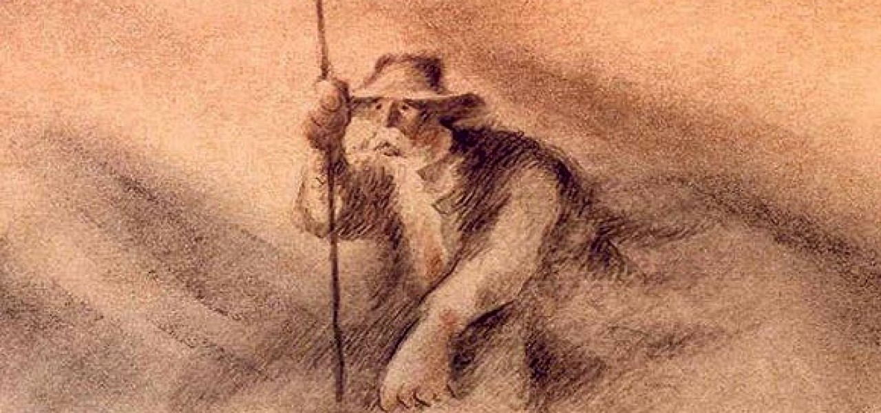
During the crit however, most people said they preferred the watercolour style of one of the early pieces of concept art which i produced right after we came up with the idea for the story. Initially i didn't agree with them, i thought the watercolour style was too boring and generic but i thought if we do it hand drawn and have watercolour over the top it might still look interesting.
Guy character designs were too 'cute' and not organic enough. They didn't really suit our animation, i waited until the crit to see what everyone else thought. During the crit everyone else thought the same and said that my early concept art was the best character design produced, i was abit surprised as the concept art was just very rough and i made it just for us to get an idea of the narrative.
Nevertheless we took the advice given to us and i took over the character design role from Guy.
When designing the character for the grandmother with Alzhiemers it was quite hard because usually when designing a character they have a distinct type of personality but with this character she has lived her life and may have had a strong personality once but now she is just a shell of that person.
I used the mood board of relatives photos we created when we first started our research to help designing the characters. However just relying on the visual side of the character would produce a very superficial empty character. Therefore i used the script to keep sight of what the character thinks about and use that insight to inform the visual side of the character. In this way the character is built in a harmony between the soul and the superficial body of the character.
During the design process for the grandmother i went through a lot of iterations. Finding the perfect design for the character is important as this could either enhance or kill the animation.
I started off using basic shapes which suited the character, i found that a rectangle made her too stable. Giving her body a more oval shape made her feel a bit less stable. Also the pose was important, at first i was making her too straight and she looked too proud so i changed her neck to be at an angle to her body so that she is in a slump. This is shown in the last piece of concept art below, it displays the character a lot more accurately.
I tried to give her some defining features sure as the mole on her cheek and the shape of her eyebrows. This helps to make the design less generic.
Although i like this design for the grandmother, i don't feel that it's perfect. I feel the design could better encapsulate the character described in the script. Although i'm finding it hard to design a character with Alzhiemers because their character is almost lost in very extreme cases and people argue that it is lost. For example one of the people we interviewed said she didn't think there was anything of who her grandmother used to be still there.
When designing the son character, i began sketching, loosely using reference from our mood board. I tried making the face different shapes and combining different features but nothing was working very well. We only need the back and part of the side of the mans face to use in the animation but nevertheless a character design should still be developed for the son as long as its not consuming too much time.
Guy was in charge of the storyboards, he is taking a long time to do them but in the meantime i just got on with other things i had to do. when he had done the storyboards they were the opposite of what we discussed. We wanted the shots to be very impactful and sensitive. However the shots changed constantly and there was no need for any of these shot changes.
I discussed this with Guy and after convincing him, he changed it.
We changed the ending to the shot backing away from the grandmother and through the keyhole in the door to reveal the corridor for the care home. We have put this in the storyboards but i am still unsure if this is the best ending.
The advantages of having this ending are that it can clearly show the grandmother is now in a care home and it gives the opportunity for an interesting shot for all the other shots to build up to.
What i mean by this is that in the first scene of our animation, there is essentially just one shot. We are using this to build the tension and the anticipation. In the next/last scene of the care home, the shots get progressively closer to the grandmother, building up the tension much higher. With the ending shot being the shot discussed before, going through the keyhole, this will hopefully bring the shots to a climax to release the tension but also converging the tension to a point. This point is that the woman is now in a care home and is essentially lost to the world.


No comments:
Post a Comment