Sunday, 23 April 2017

Responsive - 11 second club (second entry)

For this month's 11 second club Guy had an idea planned and asked me to make 3d models and rigs of his characters for him to animate. This is good practice for me so i agreed. Guy gave me specifications for the rigs and character drawing of both the characters. I did my best to keep to his idea of the characters, i think this is very important when creating characters in 3d.

Although these rigs were relatively simple, i still learnt quite a bit, mostly in the form of solidifying my knowledge of the fundamentals such as using groups as just empty transformation nodes for setting up accurate rotation orientations. I am also starting to use the node editor a lot more in my workflow which is a very healthy habit, as this gives more control of the way everything is working together and is great for figuring out problems and faults with the rig.


Responsive - Collaborative

After finishing the animatic and getting the final character designs from our illustrator, we began working on designing the card puppets.

One thing i realized when i started making some of the tests for the puppets is that this process is essentially rigging. The process is a more practical application of rigging used in 3d applications such as Maya. The same considerations need to be made, such as the range of motion needed for the arms and legs. For the different heads of the characters we used replacements, this technique can be likened to blendshapes in Maya.

When making a prototype for the arms, i realized just having joints for the shoulder and elbow wasn't enough to give the arms realistic movements. Therefore i added a scapula/collar bone joint that allowed the arm to access its full range of motion.


When designing the legs i had to consider what direction the character is facing in the shots, luckily the characters legs only needed to be facing right as the only scene of the characters face on was a mid shot which didn't include the legs. Working efficiently like this reduces production time. 


After i made the prototype for the adult characters, we made a size chart to make sure all the characters were to scale and that they would fit on the screen. It was a challenge trying to fit everyone on the screen in some scenes such as the first scene when all the characters are on the scene. However with a few altercations of the scale chart we worked it out.


After making the size chart we used it to make the characters. We used different types of card for the different characters, the characters were made out of normal matte black card whilst the elephant were made from white textured card.


After the characters were cut out we used a paint roller with acrylic paint to give some parts of the models interesting textures.


After the characters were fully complete, we split the scenes between us so we would each have an equal workload. One of the last scenes however, we decided to do all together which was interesting. We organized a day when we all came in and worked the whole day together on that scene. Rosie and Stacy both animated the children and i animated the baby elephant.

We were all pleased with the result. I think Rosie and Stacy animated the children well and i think i animated the elephant well too, the elephant has personality to it in its stumbly walk and bobbing head and it feels like a real character. Although to improve it i could have improved the secondary action.


Below is the full animation, i really enjoyed this project and learnt a lot. I have learnt not to be impatient when animating something very practical like cut out, patience is very important to achieve good animation because rushing things will not turn out well.

Thirsty Planet from Stacy Straub on Vimeo.

Below is the confirmation email for submitting to the YCN competition:


Saturday, 1 April 2017

Applied Animation - week 8

This week, the medium and aesthetic of the animation was still up in the air and i set out to solve that problem whilst guy was still working on the storyboards and Meg was working on the backgrounds and set design.

Despite getting feedback from the crit, i still felt unsure that a watercolour aesthetic was right for our animation. I felt like i wanted to try something different instead of using a generic medium and style. I did a few frames of the grandmother in her chair, just to try out some compositing tests.


When looking at coloured card in the library for the backgrounds, we came up with the idea of animating with white pencil on darker coloured card. This idea was mainly for the care home scene but we are still adapting it for the first scene. I really liked this idea, i felt like it gave the animation a more sophisticated and different aesthetic, which is what we are aiming for as it suits the content and theme of our animation. I tried out lots of different effects for the test but some of them were too much and would look silly.


We were thinking of using a more realistic but still appealing style for the animation. This aesthetic of using the inverse hand drawn frames on coloured backgrounds is better suited to the mood of our animation.

Our main problem was how to link the aesthetic of the starting scene to that of the last scene. We thought it might be good to have the grandmother 'glitch out' slightly every time she says "nice day today isn't it". When i say glitch out i mean her colours could change and her shape could distort very slightly. This would continue until the end scene is just the grandmother in inverse colours.

Meg gave me a background for the first scene so i composited the grandmother and son roughly into the scene to see how it works. Personally i think the scene looks very boring and dull, however i suspect this is mainly due to the colours being very dull and boring. I'm still not sure about the watercolour backgrounds either, i feel like there will be a better way of producing the backgrounds. The watercolour backgrounds just seem to not fit with our aesthetic but again it may just be the colours. Nevertheless i want to try out more ways of making backgrounds.


In terms of the character design, me and Guy were working together to design the characters because then we can work towards a design together which we both feel is a good design and also is relevant to our animation. I learnt a few things about character design when working on our character. I learnt that to make good, appealing, recognizable characters, they need to have distinct physical features to accentuate their personality. The visual side of the character reflects the soul of the character.

I tried using basic shapes and making the character more rounded to suggest more of a friendly and kind character to make the audience feel more compassion towards her.  However having her head more rounded like this makes her feel more cartoony and leads away from the aethetic we were working towards. Having a more cartoony character doesn't mean the animation cant still be serious but in terms of fitting in with the rest of the animation i'm not sure whether this is the best option.


Sunday, 26 March 2017

Applied Animation - Week 7

This week we had the pre-production crit. This crit was very helpful as we had things we were very unsure of such as the medium to use for the animation. Before the crit we were gravitating towards a more charcoal/ coloured pencil aesthetic, we began looking at Frederick Back and thought the medium he uses of coloured pencils would suit our animation.


During the crit however, most people said they preferred the watercolour style of one of the early pieces of concept art which i produced right after we came up with the idea for the story. Initially i didn't agree with them, i thought the watercolour style was too boring and generic but i thought if we do it hand drawn and have watercolour over the top it might still look interesting.

Guy character designs were too 'cute' and not organic enough. They didn't really suit our animation, i waited until the crit to see what everyone else thought. During the crit everyone else thought the same and said that my early concept art was the best character design produced, i was abit surprised as the concept art was just very rough and i made it just for us to get an idea of the narrative.

Nevertheless we took the advice given to us and i took over the character design role from Guy.

  
When designing the character for the grandmother with Alzhiemers it was quite hard because usually when designing a character they have a distinct type of personality but with this character she has lived her life and may have had a strong personality once but now she is just a shell of that person.

I used the mood board of relatives photos we created when we first started our research to help designing the characters. However just relying on the visual side of the character would produce a very superficial empty character. Therefore i used the script to keep sight of what the character thinks about and use that insight to inform the visual side of the character. In this way the character is built in a harmony between the soul and the superficial body of the character.

During the design process for the grandmother i went through a lot of iterations. Finding the perfect design for the character is important as this could either enhance or kill the animation.

I started off using basic shapes which suited the character, i found that a rectangle made her too stable. Giving her body a more oval shape made her feel a bit less stable. Also the pose was important, at first i was making her too straight and she looked too proud so i changed her neck to be at an angle to her body so that she is in a slump. This is shown in the last piece of concept art below, it displays the character a lot more accurately.  

I tried to give her some defining features sure as the mole on her cheek and the shape of her eyebrows. This helps to make the design less generic.


Although i like this design for the grandmother, i don't feel that it's perfect. I feel the design could better encapsulate the character described in the script. Although i'm finding it hard to design a character with Alzhiemers because their character is almost lost in very extreme cases and people argue that it is lost. For example one of the people we interviewed said she didn't think there was anything of who her grandmother used to be still there.

When designing the son character, i began sketching, loosely using reference from our mood board. I tried making the face different shapes and combining different features but nothing was working very well. We only need the back and part of the side of the mans face to use in the animation but nevertheless a character design should still be developed for the son as long as its not consuming too much time. 


Guy was in charge of the storyboards, he is taking a long time to do them but in the meantime i just got on with other things i had to do. when he had done the storyboards they were the opposite of what we discussed. We wanted the shots to be very impactful and sensitive. However the shots changed constantly and there was no need for any of these shot changes.

I discussed this with Guy and after convincing him, he changed it.

We changed the ending to the shot backing away from the grandmother and through the keyhole in the door to reveal the corridor for the care home. We have put this in the storyboards but i am still unsure if this is the best ending.

The advantages of having this ending are that it can clearly show the grandmother is now in a care home and it gives the opportunity for an interesting shot for all the other shots to build up to.

What i mean by this is that in the first scene of our animation, there is essentially just one shot. We are using this to build the tension and the anticipation. In the next/last scene of the care home, the shots get progressively closer to the grandmother, building up the tension much higher. With the ending shot being the shot discussed before, going through the keyhole, this will hopefully bring the shots to a climax to release the tension but also converging the tension to a point. This point is that the woman is now in a care home and is essentially lost to the world.

Saturday, 11 March 2017

Applied Animation - Week 6

We are gradually nearing the end of pre-production and will be soon ready to start production. The only thing holding us back from production at the moment are the storyboards and the colour tests. The character designs are mostly done and the story is essentially set in stone, we are all happy with the story and are confident in it.

There has been one key change to the story that we made this week. We changed the ending so that its raining and it's not nice weather at all but the old woman with Alzheimers still keeps saying "nice weather today isn't it?". This illustrates our point properly that she has lost herself and the setting of the rain illustrates the feelings of isolation and loneliness. The last shot changes to an exterior view of the old woman looking through the window and a slow pan out shows another resident being helped along with an umbrella outside or perhaps in another room. This is essential to making sure the audience know the final setting is a care home.

On Tuesday we had a full scheduled day of working on our project. We started by planning out our jobs, Guys jobs are character design and storyboarding. Megs jobs are set design and layout, and my jobs are writing the script and animation director, when it comes to production.

In terms of the script, i thought I'd start by just getting it all down on paper and writing a short story describing the narrative. I tried to be very descriptive because although some of the description will inevitably be lost in the visual representation, such as what the characters are thinking, these descriptions help the character designers and set designers get a better understanding of the characters and setting. Having the characters thoughts described before visually designing the characters is building the character from the inside out. Giving it a soul and then working out what that soul or essence of the character looks like visually.

The article below describes this idea, especially the section entitled 'connect the internal and external:'. It focuses on the animated film 'A Monster in Paris' in which the character design for the monster's face is a heart, this describes the character perfectly. Although everyone views him as a monster, he is really a sweet and loving character.

http://chrisoatley.com/character-design-goes-deep/

Describing the characters is only a part of the script's purpose. A good script describes the settings and more importantly, describes the mood of the scenes. This was something i made sure my script did well, just describing isn't enough. Behind the description has to be a rooted feeling which makes it's way through to the audience through the description. This plays a big part in making the audience connect emotively with the story.

Below is the short narrative i produced:


If i gave this to Guy and Meg how it is, it would be hard for Guy to produce the storyboards from and for Meg to produce the item designs. To make it easier for the rest of the team to work from i formatted it into a screenplay.

Screenplays are almost always used in the animation and film pipeline. A screenplay condenses and formats the story into a document which is easier for the rest of the production team to work from. 

Below is an example of a screenplay for Pixar's 'UP':


When writing a screenplay it is important to consider the formatting rules. These rules include capitalizing characters and items the pre-production team have to design, speech is central and although descriptions can be detailed, they are condensed to give only what's needed.

Below is my screenplay, which evolved from the previous short story i wrote:


Also this week i started worked more on the visual development. Originally we wanted to use charcoal and have a more sketchy style, however i don't think this style suits the final idea as well as other mediums might.

I did a test of the scene in charcoal pencil just to see how it would look and to be honest i quite like it but i would like more colour to be implemented. I like the way the lighting dynamics can be clearly established through charcoal and the sketchy look of the lines. I feel like charcoal could be used well to tell our story however i don't want to dismiss colour as colour can often be a great storytelling device.


Responsive - 11 second club

Throughout working on the 11 second club competition brief i have learned a lot. It is visually apparent when i watch the whole thing back that the bits i animated towards the end are a lot better than the previous bits.

I was aware of the 12 principles of animation when beginning the project but i think my understanding of the principles have been further developed by completing this brief. I feel as though its not enough to just know the principles without applying them practically. Knowledge is a lot different to understanding, knowing something doesn't necessarily mean that a person understands it.

Also applying the principles of animation on simple forms such as a sphere or a cube is different to using the principles effectively on characters.

The basic principle still stands when applying it to a character but it is a more complex application of the principle. This is what i mean when i say knowledge is not the same as understanding. If an animator can apply the principles of basic form, this does not make them a master of the principles as there are infinitely more complex forms/actions to apply the principles to.

This idea applies to the basic principles of drawing such as light, perspective and form, just to name a few. Although it is easy enough to get a grasp of the conventional methods for solving the problems of applying them within a drawing, it can take a lifetime to master these principles. Some would argue that one can never 'master' these principles because the understanding of these principles through practice could go on infinitely. This is exactly the same with the 12 principles of animation.

Besides my understanding of the 12 principles improving, my working practice has also improved. In the past i would usually just do one test of the animation and compensate for it having a few mistakes and i wold move on to the next sequence. However when working on this brief i really tried to review my line tests critically and i would alter the frames, then test it again to see if the issue is resolved.

An example of this can be taken from the first sequence i animated, i realized some of the motions of the hand were too linear and broke the feeling of fluidity within the animation.


I fixed this by adding more of an arc to the motion of the hand to make it feel like a more natural, organic motion.


One thing i learnt whilst planning the scenes was that alternating between fast movements and slow movements can have an big impact on the character performance. For example in the ending sequence, the characters motions are very fast and fluid to help show that he is confident with what he is saying. But when there was a pause in the audio i took advantage of this and animated him taking a breath and slowly taking off his glasses, then i returned to the fast motions to show him making his point.

This technique of alternating between slow and fast motions adds anticipation and also makes the animation more organic. Realistically people don't constantly use fast motions all the time. Also for the performance, as well as adding anticipation, it gives the viewer breathing space to take in the actions.

I feel like i often overlook anticipation but through this animation i have learnt to value it, as it can really affect the rest of the animation.


My animation came 41 out of 136 entries which isn't terrible but i can do a lot better. The important thing though is that i learnt a lot from doing this project and hopefully my next animation project will benefit from this.


Sunday, 5 March 2017

Applied Animation - Week 5

This week we did a few more interviews which went really well. We got quite a range of information which is what we hoped for. For example, when asked the question "do you think your relative is still the same person, that there's still something of them in there?" we got a few answers of yes but one person came out with a confident no. This is interesting because this shows how much the disease has affected the person we interviewed and that answer is based on experiences she has had with her relative.

We got lots of nice stories from them as well, from before they had dementia and how those stories changed after, which was quite upsetting.

For example in one of the interviews she said her grandmother used to make riddles about simple tasks as a joke. Such as "i was seduced by a giant melon" when she bought a melon from the supermarket. However later on when she had Alzheimers, she began to get more and more distant and mostly just sat on her chair.

Even something as simple as this story is saddening because although people may not be able to relate to having a family member with Alzheimers, people can always relate to change and loss.

These themes of change and loss are the main features of peoples experiences with family members who have Alzheimers. Also i feel that our animation should be based on the perspective of the family members around the Alzheimers patient. My reasons for this are, our research is primarily based on this perspective and me and Meg have first hand experience also. Basing it on the perspective of someone with Alzheimers, whilst maybe opening up a lot of options in terms of story, it would be hard to stay accurate. It would be hard to give an accurate picture of what its like to experience Alzheimers as none of us have and getting first hand research from people with Alzheimers is a possibility but we feel as though the people that are more effected by the disease, or the damage the disease inflicts, are the relatives of the person with Alzheimers.

Another story we had was that the person we interviewed, Hayeigh, her and her mom became essentially full time careers for her grandmother. Hayleigh was just 13 at this time so this must have been very hard for her to understand and accept at that age. She said that sometimes her grandmother would think she was a child and other times she thought she had no kids or sometimes had more kids than she did.

It must have been very hard to see someone disintegrate so much and have no dignity left at the end of her life.


On Friday we realized we needed to get a story down as soon as possible because we have been spending too much time on research and we need to form a good story from all that research, this was much harder to do than we thought.

We started by listening to the recordings and writing down the key stories that could be represented visually. This was quite useful but we were still struggling as to how to represent the effect of Alzheimers on family members of those effected. If we would have just animated along to the stories we would have felt like we failed. The reason for this is that in our opinion, mindlessly animating to someones audio clip may create an emotional response but primarily due to the audio. This approach to an animated documentary is also very unoriginal and uninspired and has been done constantly.

We wanted a more intelligent, creative, emotional narrative for our documentary.

As well as the interviews, we listened to a recording of my mum telling me some stories about her mother and grandmother who both had Alzheimers. Some of these stories were very visually adaptable but also quite cliche. For example, one of the stories was of her grandmother being found by the police at 3 in the morning in the pouring rain. Another was that her grandmother thought her husband, who had died a few years previously, was still alive and was hiding in a closet. She would shout at him through the closet.

The last story is similar to a story from one of the people we interviewed, Megan, who told us that her grandmother used to speak to her husband, who had also died previously. She said her grandmother really believed he was still there and that sometimes her family used to sit in the chair and pretend to be her grandad and her grandmother would still think it was her husband.

Seeing correlations between stories in our research informs us of the more common effects that Alzheimers has.

After listening to all the recordings and noting down stories we were still struggling to come up with any interesting, impactful ideas so we watched the short film 'Isabella' by Ross Hogg and Duncan Cowles. At first i didn't really like the simple imagery of it but then i began to feel like it was very relevant to the subject matter of Alzheimers and i really liked the extreme close up shots, i feel like they really brought out the character of the woman well.

These shots reminded me of some of Lars von Trier's work. He also uses close up shots in a way that really brings out the characters.  We could utilize this technique in our animation to better describe the feeling we are wanting to convey.


The extreme close up shots were the main inspiration we got from the film 'Isabella' and also the abstract imagery was something to note. Another point in the film i really liked was when the woman slowly and quietly said "i cant remember". Although this is a simple and almost cliche way of showing what Alzheimers is, it's very raw and effective at making the audience sympathize with the character.

We started storyboarding some ideas based on the recordings, however i still didn't feel that this was the right path as although some of the stories were interesting. the visual representation of the stories wasn't really enough to make the viewer interested in the animation or to inform the viewer of how it really feels to have a family member who has Alzheimers.

The next day we continued to work on the storyboard but we still felt it was pretty meh, not very interesting or impactful.

We then chose to work through the most interesting recording, displaying it visually. This felt more interesting than the last storyboard however it was still quite bland and nothing particularly interesting.


We then realized that our animation doesn't necessarily even need characters or a conventional narrative. What our animation needs to accomplish is conveying the feeling's of loss and isolation associated with Alzheimers to our audience. What we need to do is work out the best, most effective way of doing this through a visual medium.

After trying out some more approaches, none of them were really working and we were stuck. Then Guy said he might have a good idea. He told me to bear with him and that the story doesn't have to be this big complex thing that were striving for it to be.

His idea was a very simple one. To focus on a small part of the last recording in which she explains how her grandmother used to repeat "nice weather isn't it" over and over.

If we based the entire animation around this, it would make it simple and effective. We don't need all these strong cliche's and complex transitions, what would impact our audience the most is subtlety.

We worked on this idea, and found it exciting and realized that if we can do this effectively it would tick every box. However to make this idea work we have to be really vigilant with our storyboarding, layout and especially our animating.

The core of the idea is having an old woman looking out the window and in the room are her son, who is reading a newspaper, and her granddaughter who is playing on a gameboy or something similar.

The first time the woman says "nice day isn't it?" the man looks up from his newspaper and says "yes mum" or maybe even just looks up and doesn't say anything. The second time the man doesn't even look up at his mum but just turns the page of his newspaper. This is what i mean by subtlety. The reason it may be hard to pull off is that we need to make it clear to the audience that the man is ignoring his mum but in a passive way, he is not getting angry, he is just used to it.

Guy suggested the man clench his fist when she says it the second time but i suggested it would be better to maintain this calm environment and he just turns the page of his newspaper. This still shows he is ignoring her but just in a more subtle way. The son getting angry wouldn't be relevant to what we're trying to show.

The third or fourth time she says it, we though of having the granddaughter asking her dad "whats wrong with grandma". However i suggested that the granddaughter doesn't even say anything but just looks up from her game at her dad. Personally i think this would be enough to show what the girl is thinking without saying it and therefore keeping the tension of the scene. Having her ask her dad the question would break the tension for no reason. She is looking up at her dad out of confusion or curiosity but she senses her dad is not in the best moods for questions so she returns to her game and doesn't bother him.

Seeing things from the characters perspective is important to determine what would be a more believable response to certain situations.

What all of this is doing, the old woman repeating the line and the son and granddaughters dismissal of her, is building the anticipation. Anticipation isn't just used in the process of animation, it can be applied with great effect to the story. I mentioned the tension of the scene previously, the tension is very similar to the anticipation and the way we are structuring the tension is to not break it and keep it slowly rising throughout. Some ways we can do this is through starting off with wide shots but slowly transitioning to closer shots until we're at extreme close-ups, although this is just an idea. Using the anticipation/tension in this way will make the audience feel like something's wrong and will make them feel uneasy.

We thought briefly about the ending, about maybe having a transition of her family disappearing and she's in a care home, still staring out the window and repeats the line one last time, but this is something we still need to develop.

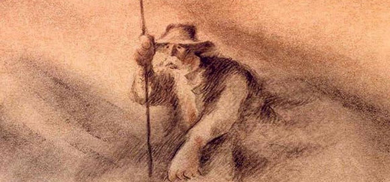
Below are some early storyboards and concept art: